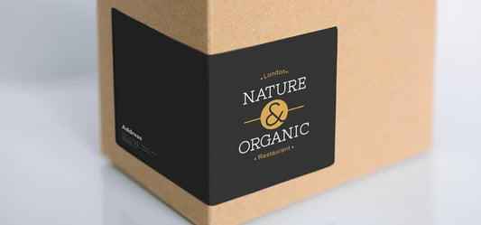
How to design a self-adhesive label and declaration?
In the world of label and sticker printing, it is important to follow the rules of graphic design in order to achieve the desired look and functionality. A good design will successfully carry your brand or the message you send with a sticker and label, but the rules of graphic preparation for printing can save that design from several serious mistakes that lurk in the production of every creative person. When you make custom stickers, you should know all the advice of the profession, but also know the tools.
Graphic Design Software Comparison: Adobe Vs. Canva vs. Word
When comparing graphic design software such as Adobe Creative Suite, Canva, and Microsoft Word for designing stickers and labels, it's essential to delve into the unique features and functionality each platform offers. Adobe Creative Suite, known for its professional tools, provides a wide range of possibilities for complex design projects. Canva, on the other hand, is popular for its user interface and affordability, making it a preferred choice for beginners or those looking to create quick designs. Microsoft Word, although not a dedicated design software, can still be used for basic design tasks due to its simplicity and affordability.
The Adobe Creative Suite stands out for its large set of tools, including Photoshop for image editing, Illustrator for vector graphics, and InDesign for layout design. These programs offer advanced features like layers, masks, and precise editing tools that meet the needs of professional designers. Overall, it is the ideal solution for all types of stickers, self-adhesive labels and stickers
Canva , in contrast, offers a more modern approach with pre-designed templates, drag-and-drop functionality, and a huge library of graphics and fonts. This makes it ideal for users who want to create visually appealing designs without the complexity of traditional design software.
Microsoft Word , although not as robust as Adobe or Canva in terms of design capabilities, can still be used effectively for simple design of self-adhesive labels, manufacturer's declarations, and printed labels. Its intuitive interface and basic design tools allow users to create simple preparations with text and a QR code or Bar code. However, it may lack the advanced features needed for complex or complex designs compared to dedicated graphic design software primarily due to the lack of control over the RGB and CMYK color models, but it is successful for pre-printing black-and-white labels and creating product labels (so-called manufacturer's declaration).
In conclusion, the choice between Adobe Creative Suite, Canva, and Microsoft Word depends on the user's skill level, design requirements, and desired level of customization. Professional designers may prefer Adobe or even CorelDraw for their versatility and advanced tools, while beginners or casual users may find Canva or even Microsoft Word more affordable for their printed sticker and label design needs. Understanding the strengths and limitations of each software can help designers make an informed decision based on their specific project requirements.

Color models: RGB vs. CMYK
Color models play a key role in graphic design for label and sticker printing because they determine how colors are displayed on digital screens and reproduced in print.
RGB (Red, Green, Blue) is an additive color model primarily used for electronic displays such as monitors and screens. In RGB mode, colors are created by combining different intensities of red, green and blue light to produce a wide range of vibrant colors suitable for digital media.
On the other hand, CMYK (cyan, magenta, yellow, black) is a subtractive color model used in printing to reproduce colors on paper. In CMYK mode, colors are created by subtracting varying amounts of cyan, magenta, yellow, and black inks from white paper. This color model is essential for print materials such as stickers and labels because it accurately represents how the colors will appear in the final printed product.
When designing labels and stickers for print production, it's crucial to work in CMYK color mode from the start to ensure that the colors you see on screen closely match the final printed output. Designing in RGB mode can result in color inaccuracies when converted to CMYK for printing due to color gamut differences between digital displays and the printing process.
Understanding when to use RGB or CMYK color modes is vital to achieving consistent and accurate color reproduction in sticker and label designs. While RGB is suitable for digital designs intended for screens with its vibrant color gamut, CMYK is necessary for print materials to ensure that colors appear as intended on physical products. By selecting the appropriate color mode based on the intended output – digital or print – designers can create visually appealing stickers and labels that meet their desired color specifications.

Bleed in press
"Bleed" or "Margo" is a critical aspect of self-adhesive label printing that designers must consider when creating labels and stickers to ensure a professional looking final product. In printing terminology, bleed refers to the extension of the background beyond the edge of the final cut line to account for slight variations during cutting. This in addition to the background, be it a color tone, photo or some other graphic element, prevents the finished product from having white edges or edges due to minor movements that may occur during cutting. This rule applies to both regular and custom shaped stickers and decals.
The golden advice of all graphic artists is to move all "important objects" such as text or essential graphic elements and symbols 2-5 mm away from the cutting line (Safe Zone) for "safety" reasons, and designers will advise you the same for purely aesthetic reasons. Keeping important design elements within the "safe zone" ensures that nothing expires when printing and cutting labels because the print product is still an analog product and carries a certain tolerance.
When laying out designs with drop areas in graphic design software such as Adobe Illustrator or InDesign, designers typically extend background elements or images beyond the cropping edge by an extra 2 or 3mm to allow room for cropping without the risk of white space showing along the edges . Printers use this extended drop area as a buffer zone during cutting to ensure that the design extends all the way to the edge without leaving.

Clipping path for an irregular sticker shape
To cut irregular shapes, the designer must create a "cut path" within the graphic design software. This allows printers to precisely cut the shape of the label without leaving marks or burrs on the edges. In production ie. making stickers - especially when it comes to stickers and stickers of custom shape. A cut path defines where the label will be cut after printing based on the specific shapes specified in the design file using vector paths known as cut paths.
Irregular-shaped labels require precise cutting paths that precisely follow the contours of the design to achieve clean edges without any excess material remaining after cutting. Designers must create these clipping paths within their graphic design software by outlining the desired shape using vector tools in a custom-generated color called "Stamp", "Tool", etc.

Font size considerations
The size of the font plays a significant role in the design of printed stickers and labels lies in its ability to clearly convey information while maintaining visual balance within the overall design composition . When choosing a font size for stickers or labels, designers must consider various factors such as viewing distance, target audience demographics, readability requirements, and overall design aesthetics to ensure effective text communication.
When choosing appropriate font sizes for stickers and labels, a few best practices can help ensure legibility and visual appeal:
- Viewing Distance : For stickers or labels intended to be viewed from a distance, opt for larger font sizes to improve readability and visibility.
- Keep legibility : Keep the font size around 7 points or more, especially for thin fonts, to ensure that the text remains legible even at smaller sizes.
- Information Hierarchy : Use a hierarchy of font sizes to differentiate the title, subtitle, and body text. Subheadings should be between the font size of your copy and the font size of your title, usually in the 14-18 point range.
- Font weight : Font weight can affect print quality. Make sure the font weight you choose complements the overall design and improves readability.
- Avoid excessive variation : While it's important to vary font sizes for emphasis and hierarchy, avoid excessive variation that can lead to a cluttered or inconsistent design.
- Readability test : Before finalizing the design, test the selected font sizes on sample prints to ensure that the text remains clear and legible at the intended size.
When choosing font sizes for stickers or labels intended for various purposes—whether informational, promotional, or decorative—designers should consider factors such as viewing distance (close versus far), legibility requirements (font style and weight), brand consistency (matching existing typography) and overall design cohesion (harmony with other visual elements). By striking a balance between legibility and aesthetics through thoughtful font size selection, designers can create exquisite sticker and label designs that effectively communicate their intended message while capturing the attention of viewers.
Font color consideration
When choosing font colors for small stickers or labels, consider the following best practices:
- Contrast : Choose a font color that provides good contrast to the background color of the sticker or label. This ensures that the text remains legible and easy to read.
- Color Psychology : Understand the emotions and associations that different colors convey. For example, red is associated with urgency and attention-grabbing, while blue is often used for trust and professionalism.
- Target Audience : Consider the target audience and the message you want to convey with the sticker or label. Choose font colors that are consistent with your brand identity and resonate with your target audience.
- Legibility : Make sure the font color is not too light or too dark, making it difficult to read. Note that lighter colors will be more difficult to read if printed on a light background.
- Color combinations : Combine font colors with background colors that complement each other to create a visually appealing design. Avoid using too many colors, as this can make the design look cluttered and unprofessional.
- Test Print : Before finalizing the design, test print the labels or stickers to make sure the font colors are legible and easy to read.
By following these best practices, you can create visually appealing and effective labels or stickers that effectively convey information while maintaining a professional appearance.

Raster vs vector in print: file format overview
When it comes to graphic design, understanding the difference between vector and raster file formats is essential to creating high-quality designs. Vector files are based on mathematical equations, which allows them to scale infinitely without losing quality. Common vector file formats include AI, CDR, and SVG. Raster files, on the other hand, are made up of pixels and are best suited for digital photos and print materials.
- GIF (Graphics Interchange Format): Image files are commonly used on the web to display graphics and logos. They also support basic animation, which means they are a popular file format for memes on social media sites. They are not recommended for the graphic design of stickers and labels. It only supports the RGB color model.
- PNG (Portable Network Graphics): PNG files are raster images that support transparency and are commonly used for web graphics. They are ideal for images with sharp edges or overlaid text due to their lossless compression. It only supports the RGB color model.
- SVG (Scalable Vector Graphics): SVG files are vector images and are commonly used to display two-dimensional graphics, charts, and illustrations on websites. It only supports the RGB color model.
- JPG (Joint Photographic Experts Group): JPG files are compressed raster images suitable for photos and web graphics. They are widely used due to their small file sizes, but can lose quality with repeated editing.
- TIF (Tagged Image Format): TIF files are high-quality raster images often used in professional printing. They support layers, transparency and high-resolution printing, making them ideal for detailed graphics.
- EPS (Encapsulated PostScript): EPS files can contain both vector and raster elements, making them versatile for different design needs. They are commonly used in print design for logos, illustrations and complex graphics.
- PDF (Portable Document Format): PDF files can contain both vector and raster elements, making them suitable for a wide range of applications. They preserve the quality of both types of images and are widely used for sharing documents on different platforms and can easily be viewed in Acrobat Reader and similar. Our recommendation is precisely for this format.
By understanding the capabilities of various file formats such as PNG, JPG, TIF, EPS and PDF in vector and raster formats, designers can choose the most appropriate format based on the specific requirements of their design projects.
Raster vs vector in printing: minimum resolution and readability
When it comes to printing, understanding the differences between raster and vector files is key to achieving optimal results. Raster images are made up of pixels, while vector images are made up of paths and shapes. Here are some key points to consider when comparing raster and vector files in terms of print quality and readability:
Raster images :
- Raster images are resolution-dependent, meaning they can appear pixelated when enlarged beyond their native resolution.
- To maintain high-quality prints, raster images should be saved at a minimum of 300 DPI (dots per inch).
- Raster images are suitable for digital photos and print materials that require a certain resolution.
Vector images :
- Vector images are resolution-independent, allowing them to scale infinitely without losing quality.
- Vector files are smaller in size than their raster counterparts, making them easier to share and edit.
- Vector images are ideal for complex designs with complex shapes and solid colors, such as logos and illustrations.
When choosing between raster and vector files for printing, consider the specific requirements of your project. For printing stickers, labels, stickers and declarations, vector or mixed vector bitmap designs that follow CMYK recommendations and recommended bitmap resolutions are most suitable. By understanding the advantages and limitations of raster and vector files, designers can make informed decisions about which format is best suited for their printing needs.

Conclusion
It is certain that there is no single advice for all cases that may arise when making graphic preparation for the printing of self-adhesive labels, but respecting all the above-mentioned tips is surely the right way to an excellent design with excellent graphic preparation.