Typedesign: typography design or vice versa?
Share
You are a creative professional. You stare at your laptop all day, and while your eyes and fingers are fitter than ever, the rest of your body feels like a crumpled up Coke can. So you go to the local gym, walk by the free weights, and come across a conversation between some muscular guys:
To the uninitiated, this exchange might as well be spoken in elvish, but to those with previous exposure to the world of bodybuilding, it goes without saying that these tough, gentle brothers are discussing what parts of their physical anatomy they plan to sculpt. Similarly, designers have their own obscure nomenclature related to the anatomy of letters. Anatomy of letters? Yes, the characters used to construct our written languages have anatomical features and classifications. In fact, the composition of letters can be quite complex. Still, some may wonder, “If letters have anatomy, is there any practical value that comes from knowing what all the little parts are called?” There certainly is. Here are four examples that show how knowing the anatomy of type can benefit professional designers:
1. Conversations with clients
Most clients will have no idea what to call the different parts of a letter. Instead, they'll say things like, "That little arc connecting the 'c' and the 't' looks weird to me." Now that you've learned the anatomy of letters, you'll know exactly what they mean - Ligatures!

"Typography is an art. Good typography is an art.”
— Paul Rand, art director and graphic designer of the IBM logo and others
2. Diagnosing design problems
Letterforms are responsible for all the design confusion. Whether in logos, section headers or navigation menus, sometimes the letters just don't look right. Knowing the anatomy of a letter will allow you to quickly determine the problem, understand why it exists and find a solution. "That 'e' looks bad because the end is too thick." Let's throw in some more narrowing."
3. Improving readability
The anatomy of a letter can actually hinder or improve legibility. For example, fonts with high counters (negative space within letters such as "p" and "o") and high x-height (lowercase height) are usually considered easier to read.
4. Fonts are everywhere
If you're a designer, there's no escape - letters dominate our physical and digital environments. With enough knowledge of type, you'll have access to more solutions when trying to solve a wide range of visual design problems. Learning the Anatomy of Lesser Known Typography There are actually a ton of letter anatomy terms out there, and unless you're a type designer, you probably don't need to learn them all. Some are obscure and rarely used in letters we regularly encounter (ball terminal, diacritics, gadzook, etc.), and others are almost universally recognized (k-height, ascender, descender, etc.). With that in mind, we present a collection of commonly used—but lesser known—typefaces that every designer should be aware of.
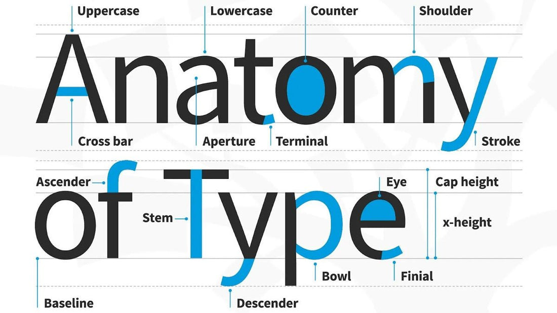
5. Short vocabulary of typography (see introductory illustration)
These are terms to have in your "type dictionary" to better understand how typeface is created and how to use it effectively in your work:
- Aperture : Partially closed letter space.
- Ascender : A vertical upward stroke that extends above the x-height.
- Baseline : The invisible line on which all letters rest.
- Bowl : Mostly round or elliptical shapes that are the basic shape of the body of the letter.
- Cap height : The distance from the base line to the top of the capital letter.
- Counter : White space surrounded by a character.
- Cross bar : Horizontal stroke of letters.
- Descender : A vertical downward stroke that extends beyond the baseline.
- Descender : A vertical downward stroke that extends beyond the baseline.
- Dot : Also known as a title , is a small diacritical mark on lowercase letters i or j.
- Eye : Closed lowercase counter e.
- Finial : A tapered or curved end on a letterform.
- Ligatures : Two or more letters joined into one character.
- Lowercase : Smaller form of the letter in the font (current).
- Shoulder : A curved stroke originating from the stem.
- Spine : The main curved stroke of a lowercase or uppercase letter.
- Stem : Main stroke which is more or less straight, not part of Bowl.
- Serif : a stroke added to the beginning or end of one of the main strokes of a letter.
- Small Capital : short capital letters (uppercase) designed to blend in with lowercase letters.
- Stroke : A straight or curved line that forms the main body of a letter.
- Terminal : A circular shape at the end of an arm, leg or eyebrow inscribed with letters.
- Uppercase : Letter print that contains uppercase letters.
- X-heigh t : The distance between the baseline and the height of the lowercase letter "x".
- Weight : The thickness of the font column.
 Infographic by Toptal
Adapted from Toptal and edited by: Stickershop


